Amoeba
Ondrej Jób /SK/
Amoeba is a classic column chart, but instead of displaying values on a straight axis, the columns are convoluted to form a circle with the spikes representing values.
Project Visible data_financing culture brings up together topics on visual communication, design, technology, new media and culture politics. By using efficient tools of information design and visualization language it makes budget for culture structures more visible.
Downloads
Visible Data 1/ 2010
Visible Data 2/2012
Visible Data 3/2012
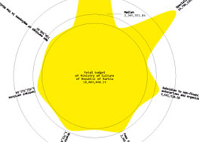
Amoeba Amoeba is a classic column chart, but instead of displaying values on a straight axis, the columns are convoluted to form a circle with the spikes representing values. |
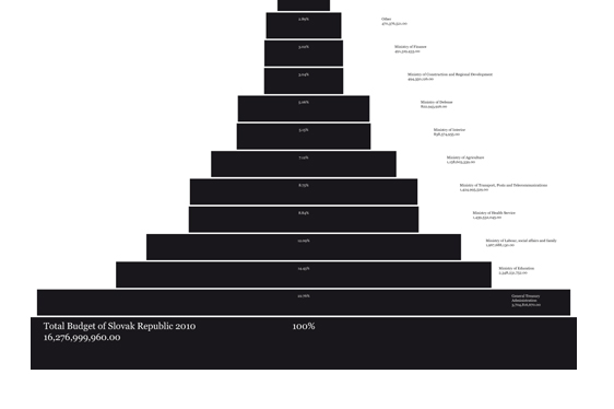
Babel The visualization presents pyramidal structure of descendent values starting at 100% basal budget. Every deeper structuring of the element spawns a new pyramid. The potential of the whole concept is based on the never-ending "plant growing" therefore the concept is able to visualize an enormous amount of data with deep structure but still keeping it in one image. |

Barcode Barcode displays data in the form of vertical bars, each representing a portion of the whole with its width. In addition, the white gaps between the bars are randomly generated and the values are randomly ordered to make the resemblance to an actual bar-code even higher. |
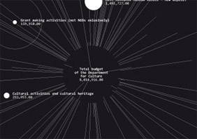
BigBang BigBang is more of a visual than a functional approach to visualising data. Each of the randomly positioned circles represent an actual value and the central circle, or the source of the explosion, has an area equal to the areas of all white circles combined. |

DataMountain DataMountain is an attempt to make a classic column chart visually attractive without loosing any functionality. The values are sorted in ascending order and displayed as rows of pointy spikes that represent values through their height. Every row is one spike shorter than the previous. Placed one behind the other, the rows create a mountain-shaped object. The median and average values are shown with two layers of clouds, which make it very easy to see which values are above or below these levels. |
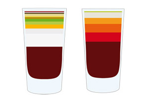
Drinkable data Drinkable data is a data representation method that turns your data into drinkable cocktails. It’s data that has a great smell, taste and can have serious affects on your brain, causing slurred speech, clumsiness, delayed reflexes and joy. It’s great for casual business meetings, office parties, exhibition openings or simple moments of joy when u want to relax and taste the smell of victory. |
Heartbeat The main concept is to remind of the degrading state of society, which is in the shadow of hypocritical statements about the idea of social equality. If the authorities keep placing art and culture on the social borderline /as they do/ and say that all men should be equal but still do not do anything about creating that equality, man will stay human just in biological form. If we don’t balance the distribution of money, certain parts of society will stop “beating”. |
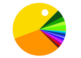
Pacman Immensely popular from its original release to the present day, Pacman is considered one of the game classics, a symbol of video games and an icon of 1980s popular culture. The game was inspired by this work visually and symbolically because of Pacmans’ voracious behavior. In this case, if someone gets a huge percentage of the state budget as opposed to all the rest, that voracious concept leads to great social inequality and corruption. |
Visible unvisible Visible unvisible brings up quick and visible information about subjects that are receiving the lowest amounts of money. This solution is coming up with opposite representation of commonly expected information. Instead of showing the biggest percentage in the most visible way it shows the smallest one vice versa. The contra-position of information comes from the frequent need of budget users to see which subject receive the lowest amounts of money. |
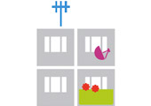
Data Building The amount of money is visually translated into material form – how many rooms and how much building equipment could be purchased with the dotation? Each element of a building represents certain value – therefor those who get a lot of money are able to build a skyscraper, those who get a little, have to be satisfied with a tiny single room. |

Chew Over Officialdom This infographic pokes fun at the impenetrable bureaucratic wilderness by taking it's aesthetics and uses them to make it's data visible. This design shows the pleasant chaos behind the facade of the order created by the government. |
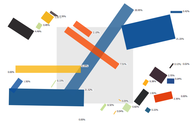
Suprémat Data-visualisation inspired by a Suprematist Composition painting by Kazimir Malevič. Both the abstract painting as inspiration and the abstract data as input create a structure which adds attractiveness to its content and allows to see and feel the essence of the data. The result is the balance between random and humanized form. It could be seen as an artists perspective on the financing culture topic. |
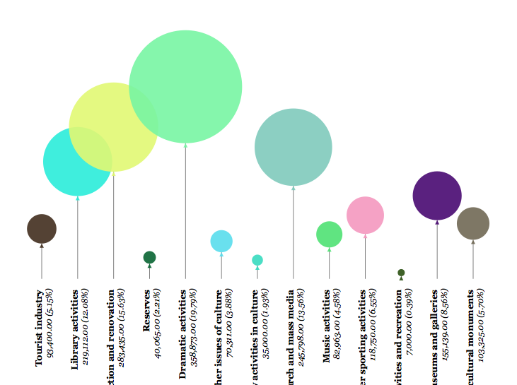
Balloons There are only a few things that can find a way to heart of a child and adult as easily as balloons. Especially, when they are inflated with funds. The more money goes into an itemof the budget, the bigger and higher a respective balloon gets. The maximum size of a balloon is constant and is assigned to the item with the largest percentage share. The rest is derived from this item. And thus the size and elevation of the balloons express the proportions of financial funds distributed within the given budget. |

Flower Power Culture is like flowers – some people love them, some can't stand them. But our ecosystem needs them for pollination and so they have to be watered every now and then. Since culture is not getting much benefits from bureaucracy, it has to be watered with wisdom. The graph captures this analogy in the form of a meadow, where overgrown flowers may slowly decay and fade away, and the under-nurtured ones can glow all the more. All the inner circles with pollen are of the same size, each representing an item itself, while the area of the outer circles with petals represent the value. If the budget had the second depth-level it could be represented by using the petals as traditional cake graph. |

Sight test There are some you must see, some you barely can. |
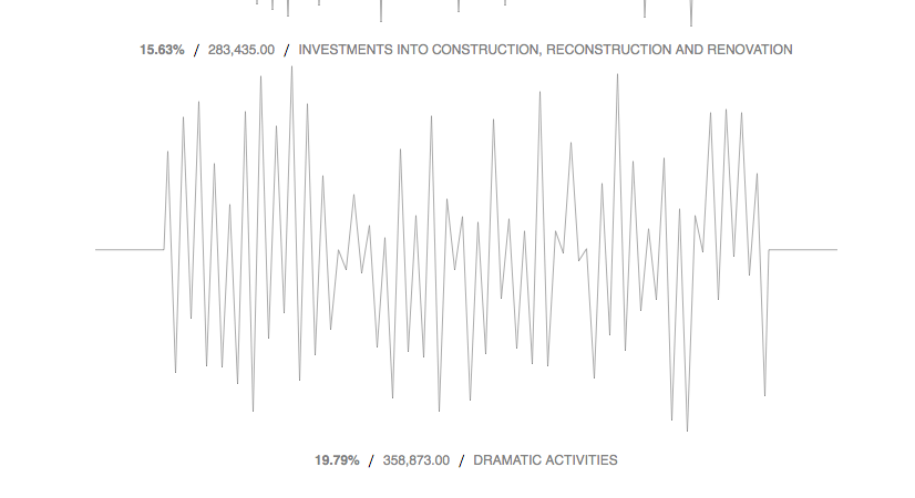
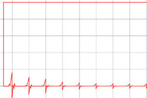
Sound graph The visualization presents the structure of sound waves, each wave indicating an area or institution by its amplitude and weight. The less the wave is visible in weight and amplitude, the smaller amount of money the institution or area gets. |